


Testimoni, baca dulu ‘kumpulan tutorial membuat loading page animasi blog cepat, komplit!’.
Gaya mirip startup Windows 8, animasi loading blog ini berwarna biru
bergerak memutar ke kanan secara cepat. Cara memasang loading page,
sobat pergi ke setelan Template dan pilih Edit HTML.
1. Paste script Jquery berikut,
2. Copy kode CSS berikut tepat di atas kode ]]></b:skin>,
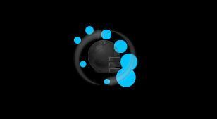 |
| Tutorial Loading Animasi Blog Mirip Startup Windows 8 (Foto: screenshoot) |
1. Paste script Jquery berikut,
<script src='http://ajax.googleapis.com/ajax/libs/jquery/1.8.3/jquery.min.js' type='text/javascript'/>___Jika telah ada sebelumnya Jquery di atas pada template blog, lewati langkah ini.
2. Copy kode CSS berikut tepat di atas kode ]]></b:skin>,
/* X-Gen Loader */3. Salin JavaScript berikut, letakan tepat di bawah kode <body>,
#xgenloader-screen {z-index:999999;background:#000;width:100%;height:100%;position:fixed !important;position:absolute;top:0;right:0;bottom:0;left:0;text-shadow:none;}
#circular3dG{
position:relative;
width:100px;
height:100px;margin:10% auto;
}
.circular3dG{
position:absolute;
background-color:#00C4FF;
width:28px;
height:28px;
-moz-border-radius:30px;
-moz-animation-name:bounce_circular3dG;
-moz-animation-duration:0.48s;
-moz-animation-iteration-count:infinite;
-moz-animation-direction:linear;
-webkit-border-radius:30px;
-webkit-animation-name:bounce_circular3dG;
-webkit-animation-duration:0.48s;
-webkit-animation-iteration-count:infinite;
-webkit-animation-direction:linear;
-ms-border-radius:30px;
-ms-animation-name:bounce_circular3dG;
-ms-animation-duration:0.48s;
-ms-animation-iteration-count:infinite;
-ms-animation-direction:linear;
-o-border-radius:30px;
-o-animation-name:bounce_circular3dG;
-o-animation-duration:0.48s;
-o-animation-iteration-count:infinite;
-o-animation-direction:linear;
border-radius:30px;
animation-name:bounce_circular3dG;
animation-duration:0.48s;
animation-iteration-count:infinite;
animation-direction:linear;
}
#circular3d_1G{
left:41px;
top:6px;
-moz-animation-delay:0.18s;
-webkit-animation-delay:0.18s;
-ms-animation-delay:0.18s;
-o-animation-delay:0.18s;
animation-delay:0.18s;
}
#circular3d_2G{
left:61px;
top:23px;
-moz-animation-delay:0.24s;
-webkit-animation-delay:0.24s;
-ms-animation-delay:0.24s;
-o-animation-delay:0.24s;
animation-delay:0.24s;
}
#circular3d_3G{
left:73px;
top:45px;
-moz-animation-delay:0.3s;
-webkit-animation-delay:0.3s;
-ms-animation-delay:0.3s;
-o-animation-delay:0.3s;
animation-delay:0.3s;
}
#circular3d_4G{
left:69px;
top:67px;
-moz-animation-delay:0.36s;
-webkit-animation-delay:0.36s;
-ms-animation-delay:0.36s;
-o-animation-delay:0.36s;
animation-delay:0.36s;
}
#circular3d_5G{
left:42px;
top:73px;
-moz-animation-delay:0.42000000000000004s;
-webkit-animation-delay:0.42000000000000004s;
-ms-animation-delay:0.42000000000000004s;
-o-animation-delay:0.42000000000000004s;
animation-delay:0.42000000000000004s;
}
#circular3d_6G{
left:8px;
top:48px;
-moz-animation-delay:0.48s;
-webkit-animation-delay:0.48s;
-ms-animation-delay:0.48s;
-o-animation-delay:0.48s;
animation-delay:0.48s;
}
#circular3d_7G{
left:0px;
top:14px;
-moz-animation-delay:0.5399999999999999s;
-webkit-animation-delay:0.5399999999999999s;
-ms-animation-delay:0.5399999999999999s;
-o-animation-delay:0.5399999999999999s;
animation-delay:0.5399999999999999s;
}
#circular3d_8G{
left:17px;
top:0px;
-moz-animation-delay:0.6s;
-webkit-animation-delay:0.6s;
-ms-animation-delay:0.6s;
-o-animation-delay:0.6s;
animation-delay:0.6s;
}
@-moz-keyframes bounce_circular3dG{
0%{
-moz-transform:scale(1)}
100%{
-moz-transform:scale(.3)}
}
@-webkit-keyframes bounce_circular3dG{
0%{
-webkit-transform:scale(1)}
100%{
-webkit-transform:scale(.3)}
}
@-ms-keyframes bounce_circular3dG{
0%{
-ms-transform:scale(1)}
100%{
-ms-transform:scale(.3)}
}
@-o-keyframes bounce_circular3dG{
0%{
-o-transform:scale(1)}
100%{
-o-transform:scale(.3)}
}
@keyframes bounce_circular3dG{
0%{
transform:scale(1)}
100%{
transform:scale(.3)}
}
<!-- Start Andi-Techno.blogspot.com Loader -->4. Selesai, klik tombol Simpan Template.
<script type='text/javascript'>
//<![CDATA[
$(function() {
setTimeout(function() {
$('#xgenloader-screen').fadeOut();
}, 5000);
});
//]]>
</script>
<div id='xgenloader-screen'><div id="circular3dG">
<div id="circular3d_1G" class="circular3dG">
</div>
<div id="circular3d_2G" class="circular3dG">
</div>
<div id="circular3d_3G" class="circular3dG">
</div>
<div id="circular3d_4G" class="circular3dG">
</div>
<div id="circular3d_5G" class="circular3dG">
</div>
<div id="circular3d_6G" class="circular3dG">
</div>
<div id="circular3d_7G" class="circular3dG">
</div>
<div id="circular3d_8G" class="circular3dG">
</div>
</div>
</div>
<!-- End Loader -->

 1 Comments