


 |
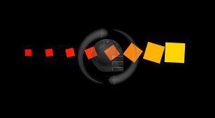
| Cara Pasang Animasi Loading Page Blog Kotak-kotak Cantik (Foto: screenshoot) |
<script src='http://ajax.googleapis.com/ajax/libs/jquery/1.8.3/jquery.min.js' type='text/javascript'/>______Jika sebelumnya telah memiliki script Jquery pada template, lewat langkah ini.
2. Copy CSS ini ke atas kode ]]></b:skin> ,
/* X-Gen Loader */3. Letakan JavaScript berikut tepat di bawah kode <body>,
#xgenloader-screen {z-index:999999;background:#000;width:100%;height:100%;position:fixed !important;position:absolute;top:0;right:0;bottom:0;left:0;text-shadow:none;}
#spinningSquaresG{
position:relative;
width:240px;
height:29px;margin:10% auto;}
.spinningSquaresG{
position:absolute;
top:0;
background-color:#FFDD00;
width:29px;
height:29px;
-moz-animation-name:bounce_spinningSquaresG;
-moz-animation-duration:0.6s;
-moz-animation-iteration-count:infinite;
-moz-animation-direction:linear;
-moz-transform:scale(.3);
-webkit-animation-name:bounce_spinningSquaresG;
-webkit-animation-duration:0.6s;
-webkit-animation-iteration-count:infinite;
-webkit-animation-direction:linear;
-webkit-transform:scale(.3);
-ms-animation-name:bounce_spinningSquaresG;
-ms-animation-duration:0.6s;
-ms-animation-iteration-count:infinite;
-ms-animation-direction:linear;
-ms-transform:scale(.3);
-o-animation-name:bounce_spinningSquaresG;
-o-animation-duration:0.6s;
-o-animation-iteration-count:infinite;
-o-animation-direction:linear;
-o-transform:scale(.3);
animation-name:bounce_spinningSquaresG;
animation-duration:0.6s;
animation-iteration-count:infinite;
animation-direction:linear;
transform:scale(.3);
}
#spinningSquaresG_1{
left:0;
-moz-animation-delay:0.24s;
-webkit-animation-delay:0.24s;
-ms-animation-delay:0.24s;
-o-animation-delay:0.24s;
animation-delay:0.24s;
}
#spinningSquaresG_2{
left:30px;
-moz-animation-delay:0.3s;
-webkit-animation-delay:0.3s;
-ms-animation-delay:0.3s;
-o-animation-delay:0.3s;
animation-delay:0.3s;
}
#spinningSquaresG_3{
left:60px;
-moz-animation-delay:0.36s;
-webkit-animation-delay:0.36s;
-ms-animation-delay:0.36s;
-o-animation-delay:0.36s;
animation-delay:0.36s;
}
#spinningSquaresG_4{
left:90px;
-moz-animation-delay:0.42s;
-webkit-animation-delay:0.42s;
-ms-animation-delay:0.42s;
-o-animation-delay:0.42s;
animation-delay:0.42s;
}
#spinningSquaresG_5{
left:120px;
-moz-animation-delay:0.48s;
-webkit-animation-delay:0.48s;
-ms-animation-delay:0.48s;
-o-animation-delay:0.48s;
animation-delay:0.48s;
}
#spinningSquaresG_6{
left:150px;
-moz-animation-delay:0.54s;
-webkit-animation-delay:0.54s;
-ms-animation-delay:0.54s;
-o-animation-delay:0.54s;
animation-delay:0.54s;
}
#spinningSquaresG_7{
left:180px;
-moz-animation-delay:0.6s;
-webkit-animation-delay:0.6s;
-ms-animation-delay:0.6s;
-o-animation-delay:0.6s;
animation-delay:0.6s;
}
#spinningSquaresG_8{
left:210px;
-moz-animation-delay:0.66s;
-webkit-animation-delay:0.66s;
-ms-animation-delay:0.66s;
-o-animation-delay:0.66s;
animation-delay:0.66s;
}
@-moz-keyframes bounce_spinningSquaresG{
0%{
-moz-transform:scale(1);
background-color:#FFDD00;
}
100%{
-moz-transform:scale(.3) rotate(90deg);
background-color:#FF0000;
}
}
@-webkit-keyframes bounce_spinningSquaresG{
0%{
-webkit-transform:scale(1);
background-color:#FFDD00;
}
100%{
-webkit-transform:scale(.3) rotate(90deg);
background-color:#FF0000;
}
}
@-ms-keyframes bounce_spinningSquaresG{
0%{
-ms-transform:scale(1);
background-color:#FFDD00;
}
100%{
-ms-transform:scale(.3) rotate(90deg);
background-color:#FF0000;
}
}
@-o-keyframes bounce_spinningSquaresG{
0%{
-o-transform:scale(1);
background-color:#FFDD00;
}
100%{
-o-transform:scale(.3) rotate(90deg);
background-color:#FF0000;
}
}
@keyframes bounce_spinningSquaresG{
0%{
transform:scale(1);
background-color:#FFDD00;
}
100%{
transform:scale(.3) rotate(90deg);
background-color:#FF0000;
}
}
<!-- Start Andi-Techno.blogspot.com Loader -->4. Konfigurasi selesai, klik Simpan Template.
<script type='text/javascript'>
//<![CDATA[
$(function() {
setTimeout(function() {
$('#xgenloader-screen').fadeOut();
}, 5000);
});
//]]>
</script>
<div id='xgenloader-screen'><div id="spinningSquaresG">
<div id="spinningSquaresG_1" class="spinningSquaresG">
</div>
<div id="spinningSquaresG_2" class="spinningSquaresG">
</div>
<div id="spinningSquaresG_3" class="spinningSquaresG">
</div>
<div id="spinningSquaresG_4" class="spinningSquaresG">
</div>
<div id="spinningSquaresG_5" class="spinningSquaresG">
</div>
<div id="spinningSquaresG_6" class="spinningSquaresG">
</div>
<div id="spinningSquaresG_7" class="spinningSquaresG">
</div>
<div id="spinningSquaresG_8" class="spinningSquaresG">
</div>
</div>
</div>
<!-- End Loader -->

 0 Comments